

A presell page is a content-first landing page that warms cold traffic before asking for a purchase or email, and the three formats worth knowing first are the advertorial, the quiz funnel, and the VSL pre-lander. If you want to see how real brands execute each one, jump to the annotated examples below. If you want a build checklist, skip ahead to the step-by-step section. According to LanderLab’s breakdown of presell formats, there are five main structures in active use, and matching the right one to your traffic source is what separates a page that converts from one that bleeds ad spend.
Key Takeaways
Matching your presell format to your traffic source is the single highest-leverage decision you make when building a presell page, because the wrong format wastes every dollar of ad spend before the visitor even reaches your offer.
| Point | Details |
|---|---|
| Match format to traffic | Advertorials fit native/social; listicles fit search; quiz funnels fit social and email. |
| Headline drives everything | Write the hero headline first using curiosity-gap, number-led, or problem-solution templates. |
| Bridge sentence is critical | The bridge must name exactly what the visitor sees next; vague CTAs cause the biggest drop-offs. |
| Proof belongs above the fold | Specific metrics (“4.8 stars from 12,000 reviews”) convert; generic claims (“customers love it”) do not. |
| Track micro-conversions | Scroll depth, video starts, and CTA clicks tell you where the page breaks before the downstream CVR does. |
| Willbuckley accelerates the build | Willbuckley’s coaching platform provides copy templates, a CRO checklist, and a 30-minute audit for affiliate marketers building presell funnels. |
Table of Contents
- What is a presell page and when does it belong in your funnel?
- Common types of presell pages and how to choose the right one
- Presell page examples: 10 real-brand teardowns
- How to write a presell page from scratch
- Presell page best practices and mistakes to avoid
- Ready-to-use presell page templates
- Which metrics matter and how to A/B test your presell page
- How AI speeds up presell page creation and personalization
- The thing most marketers get wrong about presell pages
- What Willbuckley offers for presell page builders
- Sources
What is a presell page and when does it belong in your funnel?
A presell page sits between your ad and your offer. It does not sell. It qualifies, educates, and removes friction so that by the time a visitor hits your product page or checkout, they already understand the value and have started to trust you.
Most direct-to-offer funnels fail with cold traffic because the visitor has no context. They clicked an ad, landed on a product page, and felt nothing. A presell page fixes that gap.
The four core goals a presell page serves:
- Qualify traffic so only motivated visitors continue to the offer
- Reduce cart friction by handling objections before the product page loads
- Seed micro-conversions (scroll depth, video starts, email capture) that your pixel can optimize toward
- Align messaging between the ad creative and the offer so the visitor’s mental model carries through
The funnel path looks like this: visitor clicks ad → lands on presell page → clicks through to product page or checkout (click-through variant) OR submits email → enters nurture sequence → sees offer (lead-gen variant). You choose the click-through path when the offer is low-ticket and the purchase decision is fast. You choose the email-capture path when the offer is high-ticket, regulated, or needs multiple touchpoints.
Traffic sources that most commonly need a presell layer:
- Native advertising (Taboola, Outbrain) where intent is browsing, not buying
- Paid social (Meta, TikTok) where audiences are cold and interruption-based
- Affiliate sends where the publisher’s audience has no prior brand relationship
- Paid search for competitive keywords where the searcher is still comparing options
Common types of presell pages and how to choose the right one
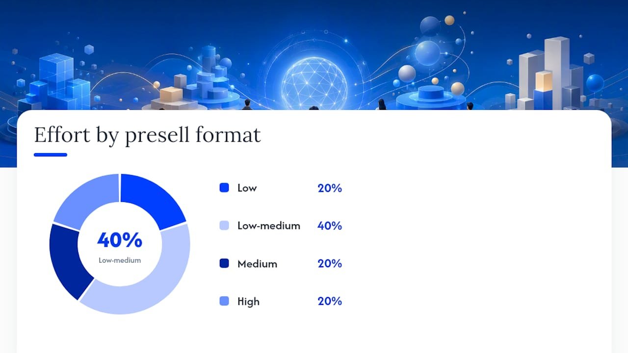
LanderLab identifies five presell formats that consistently convert: advertorial, quiz funnel, VSL pre-lander, listicle/review, and problem/solution. Each one maps to a different campaign goal and traffic source.
| Format | Primary goal | Best traffic source | Primary CTA | Key elements | Effort | Conversion signal to track |
|---|---|---|---|---|---|---|
| Advertorial | Educate + build trust | Native, paid social | Click to product page | Hook, story, proof, bridge | Medium (600–1,200 words) | CTR to offer, time on page |
| Listicle/Review | Compare + self-qualify | Search, SEO-adjacent | Click to product or review | Headers, benefit bullets, ratings | Low-medium | Scroll depth, CTR |
| Quiz funnel | Qualify + personalize | Paid social, email | Email capture or direct buy | Questions, progress bar, results page | High (multi-step) | Quiz completion rate, email opt-in |
| VSL pre-lander | Demonstrate high-ticket value | Paid social, YouTube | Watch VSL / book demo | Headline, video embed, minimal text | Low (page is simple) | Video start rate, CTR to VSL |
| Problem/solution | Agitate pain + present fix | Native, affiliate | Click to product or checkout | Problem framing, solution reveal, CTA | Low-medium | CTR, bounce rate |
A few practical notes on choosing. The listicle format is particularly strong for search and SEO-adjacent traffic because skimmers can self-qualify by scanning headers alone without reading every word. The quiz funnel earns its complexity for higher-ticket or regulated verticals because it lets you qualify and personalize before the product ask, which tightens lead quality noticeably. VSL pre-landers keep the page itself minimal: the headline does the hook, and the video does the heavy lifting.
HelloFresh uses a click-through advertorial style. Stitch Fix and Function of Beauty lean on quiz funnels. Philips and Urban Decay use product-highlight presells. LionStory runs a story-driven advertorial. Zendesk, Loom, and Semrush use lead-gen presells with free trial or demo CTAs. Audible runs a value-stacking click-through page.
Presell page examples: 10 real-brand teardowns
These are annotated breakdowns of how each brand structures its presell, what persuasion element carries the page, and what you can borrow today. Sources for the ecommerce examples come from ConvertFlow’s annotated teardowns and OptinMonster’s structural analysis.
HelloFresh
HelloFresh leads with a lifestyle headline that speaks to the outcome (“Dinner sorted, stress gone”) rather than the product. The primary persuasion element is social proof stacked early: a review count and a star rating appear above the fold, before any pricing. The page bridges to a meal-plan selector, which acts as a micro-commitment step before checkout.
What to borrow: Put your star rating or review count in the hero, not buried below the fold. The micro-commitment step (a selector or quiz) before the CTA reduces checkout abandonment.
Swipe copy ideas:
- “Dinner on the table in 30 minutes. No planning, no guessing.”
- “Over [X] families already eating better. Here’s how.”
CTA destination: Meal plan selector → checkout. Complexity: low.
Philips
Philips uses a product-highlight presell that leads with a specific use-case claim (“Clinically tested for sensitive skin”) rather than a generic brand statement. The page is short, benefit-led, and uses a single product image with annotated callouts pointing to key features. There is no distracting navigation.
What to borrow: Feature callouts on the product image do the work that body copy usually tries to do. One focused use-case claim outperforms a list of generic benefits.
Swipe copy ideas:
- “Tested on [X] skin types. Designed for yours.”
- “One device. Three settings. Zero irritation.”
CTA destination: Direct product page. Complexity: low.
Stitch Fix
Stitch Fix’s presell is a quiz funnel. The page opens with a single question (“What’s your style?”) and a progress bar. Each answer personalizes the results page, which then presents a curated box as the natural next step. The quiz completion rate is the primary conversion signal, not the CTA click.
What to borrow: A progress bar increases quiz completion. Frame each question as a preference, not a data-collection exercise. The results page is where the real sell happens.
Swipe copy ideas:
- “Tell us your style in 60 seconds. We’ll handle the rest.”
- “Answer 5 questions. Get a box built for you.”
CTA destination: Email capture on results page → curated box offer. Complexity: high (multi-step).
Function of Beauty
Function of Beauty runs a quiz funnel that goes deeper than Stitch Fix: it asks about hair type, goals, and even fragrance preference. The personalization payoff is explicit (“Your formula, made for you”) and the results page shows a mockup of the custom product with the visitor’s name on it. That visual is the conversion anchor.

What to borrow: Show a personalized product mockup on the results page. The more specific the output looks, the harder it is to walk away.
Swipe copy ideas:
- “Your hair is different. Your shampoo should be too.”
- “3 minutes. A formula made only for you.”
CTA destination: Personalized product page → checkout. Complexity: high.
Urban Decay
Urban Decay uses a product-highlight presell built around a single hero product with a bold visual and a short, punchy subhead that speaks to identity (“Beauty with an edge”). The page is visually heavy, with minimal text. The CTA is a single “Shop now” button with no secondary options.
What to borrow: For fashion and beauty, visual identity carries more weight than copy. One CTA with no alternatives reduces decision fatigue.
Swipe copy ideas:
- “Not your average [product category].”
- “Made for people who don’t follow rules.”
CTA destination: Product page. Complexity: low.
LionStory
LionStory runs a story-driven advertorial that opens with a personal narrative before introducing the product. The hook is a relatable problem (“I tried everything and nothing worked”), the body builds credibility through a transformation story, and the bridge sentence sets up the product as the logical conclusion. This is the classic advertorial pattern: hook → educate → prove → tease → CTA.

What to borrow: The bridge sentence is the most important line on an advertorial. It should set an expectation that the offer page immediately continues, not restarts. A mismatch between the advertorial’s closing promise and the offer page’s opening causes the biggest drop-offs.
Swipe copy ideas:
- “I didn’t believe it until I tried it for 30 days.”
- “Here’s what actually changed everything for me.”
CTA destination: Product page or VSL. Complexity: medium.
Zendesk
Zendesk’s presell is a lead-gen page targeting B2B buyers. It leads with a specific outcome claim (“Resolve tickets 40% faster”) and uses a short benefit list plus a customer logo strip as social proof. The CTA is a free trial, not a purchase. The page is designed to capture a business email, not close a sale.
What to borrow: For B2B, a customer logo strip above the fold signals credibility faster than any testimonial. Outcome-specific claims (“40% faster”) outperform feature claims (“robust ticketing system”).
Swipe copy ideas:
- “Your support team resolves more. Your customers wait less.”
- “Join [X] companies already cutting response time.”
CTA destination: Free trial sign-up (email capture). Complexity: low.
Audible
Audible’s presell stacks value before the ask: it lists what you get (one free book, access to the full catalog, cancel anytime) before mentioning the subscription cost. The page answers the three most common objections (What do I get? What does it cost? Can I cancel?) in the hero section. The CTA is “Start your free trial.”
What to borrow: Answer the top three objections in the hero. “Cancel anytime” is not just a reassurance; it is a conversion driver. Put it near the CTA button, not in the fine print.
Swipe copy ideas:
- “Your first book is free. Cancel whenever you want.”
- “One book a month. Thousands to choose from.”
CTA destination: Free trial (email + payment details). Complexity: low.
Loom
Loom uses a short VSL pre-lander: a headline, a 90-second product demo video, and a single CTA. The page has almost no body copy. The video does the persuasion work. The CTA appears both above and below the video to catch visitors who watch to the end and those who click early.
What to borrow: Place your CTA above and below the video. Visitors who click before watching and those who finish the video are two different behavioral segments, and both deserve a frictionless path forward.
Swipe copy ideas:
- “See how [X] teams record and share updates in 90 seconds.”
- “Watch this. Then try it free.”
CTA destination: Free sign-up. Complexity: low.
Semrush
Semrush runs a listicle-style presell for search traffic: a numbered list of SEO problems with a solution mapped to each one. The page is long-form, skimmable, and ends with a free trial CTA. Social proof appears mid-page as a case study callout with a specific result (“Increased organic traffic by 300%”).
What to borrow: Place a case study callout with a specific metric mid-page, not just at the bottom. Visitors who are still reading at the midpoint are your highest-intent prospects, and a concrete result at that moment can push them to the CTA.
Swipe copy ideas:
- “5 SEO problems killing your rankings (and how to fix them today).”
- “Here’s what [X] marketers discovered when they audited their site.”
CTA destination: Free trial. Complexity: medium.
How to write a presell page from scratch
Follow this ordered checklist. Each step builds on the last, and skipping one usually shows up as a drop-off in your analytics.
- Write the hero headline first. Use one of three templates: curiosity-gap (“The [X] mistake costing you [Y]”), number-led (“7 reasons your ads aren’t converting”), or problem-solution (“Stop losing leads. Here’s what to do instead”). The headline sets the contract with the visitor.
- Open with a value-first paragraph. State the problem the visitor came to solve in the first two sentences. Do not introduce your brand yet.
- Add credibility early. One data point, one customer result, or one recognizable logo placed in the first scroll is enough. Do not wait until the bottom of the page.
- Write the body as a story or a list. Advertorials use narrative. Listicles use headers. Pick one and stay consistent. Daily Intel’s advertorial template recommends 600–1,200 words for advertorials and 400–700 for news-style presells.
- Handle the top two objections inline. Do not save them for an FAQ at the bottom. Weave them into the body where a skeptical reader would naturally raise them.
- Write the bridge sentence. This is the single most important line on the page. It should set an expectation that the offer page immediately continues. “Click below to see the exact [product/tool/plan] I used” is a bridge. “Buy now” is not.
- Place the CTA. Match the CTA to the format and traffic source: “Start free trial” for SaaS, “See my plan” for ecommerce quiz funnels, “Watch the full video” for VSL pre-landers, “Join the waitlist” for launches.
- Set up tracking before you publish. UTM parameters on every inbound link, a scroll-depth event at 50% and 75%, a CTA click event, and a video-start event if you have video. These are your micro-conversions.
Three headline templates with usage notes:
- Curiosity-gap: “The [X] mistake costing [audience] [Y]” — works best for native and paid social where the hook needs to interrupt a scroll.
- Number-led: “[Number] ways to [outcome] without [pain]” — works best for search and listicle formats where the visitor is already comparison-shopping.
- Problem-solution: “Stop [pain]. Here’s [fix]” — works best for advertorials and VSL pre-landers where the visitor has already identified their problem.
Presell page best practices and mistakes to avoid
The most common mistake is a messaging mismatch between the ad and the presell page. If your ad says “5 tips for better sleep” and your presell opens with a product pitch, the visitor feels deceived and bounces immediately. The ad creative, the presell headline, and the offer page headline should form a continuous narrative thread.
Waiting too long to get to the offer is the second most frequent error. Advertorials and listicles need to earn the click, but burying the CTA below 2,000 words of copy means most visitors never see it. Place a CTA after the proof section, not just at the end.
Invisible proof is a structural problem. Social proof placed below the fold, in small font, or without a specific metric (“customers love it” vs. “4.8 stars from 12,000 reviews”) does almost nothing for conversion. Specificity is what makes proof credible.
Overloading the page with multiple actions is a conversion killer. One presell page, one goal. If you want an email capture and a product click, you are running two campaigns on one page. Pick one.
Poor mobile formatting affects every presell page running paid social traffic. Long paragraphs, small CTAs, and videos that do not autoplay on mobile are the three fastest ways to lose a visitor who came from a phone.
Best-practice checklist for credibility and compliance:
For advertorials, include a clear disclosure (“This is a sponsored article” or “Advertorial”) at the top of the page. Most ad platforms require it, and it builds trust rather than undermining it. Use conservative language for proof claims: “reported by,” “as seen in,” or “customers say” rather than absolute guarantees. Never claim a specific income or health outcome unless you have documented evidence and legal clearance for your market.
Ready-to-use presell page templates
These four templates are designed to drop into any page builder. Adapt the bracketed fields to your offer.
Template 1: Advertorial hero block
Headline: “The [X] Mistake [Audience] Make Before [Outcome]”
Subhead: “Here’s what [number] [audience] discovered when they stopped [pain] and started [fix].”
Opening line: “If you’ve been [doing X] and not seeing results, this is the reason why.”
CTA destination: Product page or VSL. No form fields needed.
Template 2: Listicle intro block
Headline: “[Number] Reasons Your [Goal] Isn’t Working (And What to Do About It)”
Subhead: “Most [audience] skip step [X]. Here’s the full list.”
Opening line: “You’ve probably tried [common solution]. It works for some people. Here’s why it might not be working for you.”
CTA destination: Product page or review page. No form fields.
Template 3: Quiz funnel CTA block
Headline: “What’s Your [Goal] Type?”
Subhead: “Answer [number] quick questions. Get a [personalized result] built for your situation.”
Button copy: “Find My [Result] →”
CTA destination: Results page with email capture. Form field: first name + email.
Template 4: VSL bridge paragraph
Compliance-friendly proof phrasing:
Use “customers report,” “as seen in,” “based on [X] reviews,” or “reported results” rather than guaranteed outcomes. For button microcopy, “Cancel anytime,” “No credit card required,” and “Free for [X] days” are the three highest-trust phrases in active use. Place them directly below the CTA button, not in a footnote.
Which metrics matter and how to A/B test your presell page
The five metrics that tell you whether a presell page is working:
- CTR from ad to presell (are people clicking through from the ad?)
- Time on page (are they reading, or bouncing immediately?)
- Scroll depth at 50% and 75% (are they reaching the proof and CTA sections?)
- CTA click-through rate (are they clicking the bridge to the offer?)
- Downstream conversion rate (are those clicks turning into purchases or trials?)
The downstream conversion rate is the one most marketers ignore. A presell page with a 15% CTR that sends unqualified traffic to checkout is worse than one with a 6% CTR that sends buyers.
Six A/B test hypotheses worth running:
- Headline variation: Test curiosity-gap vs. number-led headline. Expected impact: CTR from ad, time on page.
- Hero media: Test a static image vs. a short autoplay video in the hero. Expected impact: scroll depth, video start rate.
- CTA destination: Test direct product page vs. VSL page as the CTA target. Expected impact: downstream conversion rate.
- Social proof placement: Test proof above the fold vs. mid-page. Expected impact: CTA click-through rate.
- CTA copy: Test “See my plan” vs. “Start free” vs. “Watch the video.” Expected impact: CTA CTR.
- Page length: Test a 600-word vs. 1,200-word version of the same advertorial. Expected impact: scroll depth, downstream CVR.
For statistical significance, aim for at least 500 CTA clicks per variant before calling a winner. If your traffic volume is lower, run the test longer rather than calling it early. A result based on 80 clicks per variant is not a result; it is noise.
How AI speeds up presell page creation and personalization
AI does not replace the strategic thinking behind a presell page, but it cuts the time to a first draft from hours to minutes. Here are three prompt templates you can run right now.
Prompt 1: Headline generation for paid social traffic
Prompt 2: Objection-handling bullets
Prompt 3: Bridge paragraph tuned for a specific UTM
A simple automation workflow: generate five headline variants using Prompt 1, load them into your A/B testing tool (Google Optimize, VWO, or a native page builder split-test), run the test to 500 clicks per variant, then route the winning headline’s traffic into an email nurture sequence via your ESP (Klaviyo, ActiveCampaign, ConvertKit). The whole loop takes about two hours to set up.
For dynamic personalization, use UTM parameters to reflect ad creative signals in your hero copy. If a visitor arrives with utm_content=sleep_tips, your hero headline can dynamically read “The sleep tip [X] people are talking about” instead of a generic opener. Most modern page builders (Unbounce, Instapage, Webflow) support dynamic text replacement natively.
Pro Tip: Run your AI-generated headlines through a readability checker like Hemingway Editor before publishing. A headline that scores above grade 10 on Flesch-Kincaid tends to underperform on mobile social traffic, where reading speed and attention are both compressed.
The thing most marketers get wrong about presell pages
Here is a perspective that does not get said enough: most presell pages fail not because of bad copy, but because of a broken belief about what the page is supposed to do.
A presell page is not a softer version of your sales page. It is a trust-building mechanism, and trust is built through specificity, not enthusiasm. The brands that consistently get this right, like Semrush with its outcome-specific case study callouts and Audible with its objection-first hero, lead with something concrete and verifiable. The ones that fail lead with adjectives.
The second thing worth saying plainly: the bridge sentence is where most advertorials collapse. Copywriters spend 800 words building a story and then write “Click here to learn more” as the bridge. That is not a bridge; it is a dead end. The bridge should name exactly what the visitor is about to see and why it is the logical next step from what they just read. Zipify’s reported $18M in sales from a single pre-sell engagement page template, as documented on their site, did not happen because the copy was clever. It happened because every element, including the bridge, was aligned.
If you take one thing from this guide, make it this: write the bridge sentence before you write the headline. It forces you to know exactly where the visitor is going and why, which makes every other element on the page easier to write.
What Willbuckley offers for presell page builders
Building a presell page from scratch is straightforward once you have the right assets. Willbuckley’s coaching and content platform gives affiliate marketers and digital entrepreneurs a concrete shortcut: templated copy blocks, a CRO checklist, and a personalization workflow built specifically for AI-assisted presell page creation.

Here is what you get when you work with Willbuckley:
- Presell page copy templates for advertorial, listicle, quiz funnel, and VSL pre-lander formats
- A CRO checklist covering headline, proof placement, bridge copy, and CTA optimization
- A 30-minute coaching audit where Will reviews your current funnel and identifies the highest-leverage fix
- AI prompt library for generating headline variants, objection-handling bullets, and bridge paragraphs tuned to your traffic source
The difference between Willbuckley and a generic template library is the coaching layer. Templates tell you what to write. The audit tells you why your current page is not converting and what to change first. Visit the Willbuckley sample page to see the full offering and book your audit.
Sources
Before borrowing exact copy from any live presell page, check the page directly. Brands update their funnels frequently, and a teardown published six months ago may reflect a version that no longer runs.
- Presell Page Examples: 5 Formats That Actually Convert (2026)
- How to Write a Pre-Sell Page (+ Examples) | Landra
- 6 Ecommerce Presell Page Examples That Prep Your Visitors to Buy
- How to Create A Pre-Sell Page with Examples