

A bridge page is a short, focused pre-sell page that warms cold traffic and boosts conversion before sending visitors to a merchant offer. It’s the layer between an ad or a piece of content and the affiliate link, and it exists to build trust, capture a lead, and pass advertising platform reviews that direct affiliate links often fail.
The highest-converting formats, in rough order of how often affiliates use them, are:
- Advertorial — a story-driven article that reads like editorial content
- Quiz — a short interactive tool that segments visitors into offer buckets
- Calculator — a savings or cost tool that delivers instant, personalized value
- VSL (video sales letter) — a short video that does the persuading before the click
- Review/pre-sell page — a compact, honest comparison of one product’s fit
- Lead magnet page — a free resource offered in exchange for an email address
Use a bridge page whenever you’re running paid traffic, need to build trust with cold visitors, or want to capture an email before the sale. Skip it and link direct only when you already have a warm, high-trust audience (an established email list or a loyal YouTube following) that doesn’t need convincing.
Key Takeaways
Bridge pages convert better than direct affiliate links because they build trust, qualify leads, and satisfy ad platform rules before the merchant handoff ever happens.
| Point | Details |
|---|---|
| Pick the format that fits your traffic | Advertorials suit organic and YouTube traffic; quizzes and calculators suit paid cold traffic. |
| Disclosure goes near the top | Place it above the fold, right under the headline or intro, not buried in a footer. |
| The fit-check table cuts wasted clicks | Tell visitors plainly who the offer fits and who should skip it before they click through. |
| One CTA, repeated sparingly | Stick to a single primary call to action, repeated at most twice on the page. |
| Test one variable, track four metrics | Watch click-through rate, opt-in rate, email-to-sale conversion, and time on page for every test. |
| Willbuckley provides copy-ready templates | The sample bridge page and coaching content give you a working structure to adapt instead of building from scratch. |
Table of Contents
- What Bridge Page Examples Reveal About the Affiliate Funnel
- Bridge Page Formats and Practical Examples
- Bridge Page Structure: A Copyable Template and Wireframe
- How Bridge Pages Fit the Funnel and the Email Follow-Up
- Best Practices and Compliance for Bridge Pages
- Testing and Metrics: What to Track and How to Iterate
- A Publisher’s Checklist and Sample Bridge Page to Copy
- Six Mini Bridge Page Examples You Can Model Today
- When I Use Bridge Pages and Why It Depends on the Traffic
- How Willbuckley Turns These Templates Into Launch-Ready Pages
- Sources
What Bridge Page Examples Reveal About the Affiliate Funnel
A bridge page sits in the middle of a three-step chain: traffic arrives from an ad, a blog post, or a video, lands on the bridge page, and then gets routed to the merchant. That middle step is where the real work happens. Instead of asking a stranger to trust an unfamiliar merchant site cold, you get one shot to build credibility, frame the offer, and often collect an email address before they ever see a “buy now” button.
Three things make that middle step worth building:
- Conversion warming. A visitor who reads a short, honest case for a product converts at a noticeably higher rate than one dropped straight onto a sales page they’ve never heard of.
- Internal monetization. Once you own the email address, you can market to that person again, on your own schedule, instead of losing them the moment they leave the merchant’s site.
- SEO hygiene. Hosting your own content means Google indexes your domain instead of sending all the authority-building work to someone else’s page.
There’s also a technical reason bridge pages exist that has nothing to do with persuasion. Many ad platforms restrict or outright ban direct affiliate links in paid campaigns, and a bridge page functions as compliant middle ground that satisfies platform reviewers while still routing traffic toward the offer. Skip this step on Meta or Google Ads and you risk an account suspension over a single flagged link.
Bridge Page Formats and Practical Examples
Each format below solves a different problem. Pick the one that matches your traffic source and your offer, not the one that looks fanciest.
Advertorial. This is the workhorse format, and for good reason: it reads like a news story or a personal account, not an ad. The structure that performs follows a simple arc: a relatable hook (a problem the reader recognizes), a discovery moment (how the “solution” was found), a credibility line (why this source is worth trusting), a short pros-and-cons breakdown, and a single CTA. Advertorials work best with health, finance, and “as seen on” style offers where a personal narrative lowers guard faster than a spec sheet would.
Quiz. A quiz earns attention because it feels personalized instead of pitched. The mechanics matter more than the questions themselves: three to five questions max, each one mapping cleanly to a specific outcome, and a results page that routes each answer combination to the offer that fits it best. The opt-in usually sits between the last question and the results reveal, which is the moment curiosity peaks and abandonment drops.
Calculator. Calculators work because they deliver value instantly, before you’ve asked for anything. A savings calculator, a mortgage estimator, or an insurance cost tool takes two or three inputs and spits out a number the visitor cares about. Gate the detailed breakdown behind an email opt-in, but always show a partial result up front. A calculator that demands an email before revealing anything feels like a bait and switch and kills trust immediately.
VSL (video sales letter). A short VSL, typically two to four minutes, follows a tight script: hook in the first ten seconds, agitate the problem for thirty seconds, present the solution with light proof, and land the CTA before minute three. Put the CTA button below the video and repeat it as text link once more further down the page, because a meaningful share of viewers won’t finish the video.
Review/pre-sell page. This format works like a mini buyer’s guide for a single product. Keep the specs compact, add a short “who this fits / who should skip it” block, list honest pros and cons (a page with zero cons reads as fake), and mention one or two alternatives by category rather than name. That last touch, oddly, tends to increase clicks to the main offer, because it signals you’re not desperate to close the sale.
Lead magnet bridge. Instead of a product-review angle, this format leads with a free resource: a checklist, a mini course, a swipe file. The bridge page’s only job is explaining what the magnet delivers and getting the opt-in. The actual selling happens later, in the email sequence that follows delivery.
Pro Tip: Match format to intent, not personal preference. Quizzes crush it on cold social traffic where curiosity drives clicks; calculators dominate on search traffic where visitors already have a specific number in mind. A quiz on high-intent search traffic just adds friction.
Bridge Page Structure: A Copyable Template and Wireframe
Every high-performing bridge page shares the same skeleton, regardless of format. Here’s a version you can adapt directly.

Headline. Lead with the outcome, not the product name. “How I Cut My Grocery Bill by Shopping Smarter” beats “ProductName Review” every time, because it speaks to a result the reader already wants.
Lead paragraph. Open with a one or two sentence version of your own experience or discovery moment, then state plainly what the page will cover. Don’t bury this in throat-clearing.
Disclosure. Place it near the top, right under the headline or intro paragraph, not buried in a footer. A transparent bridge page template puts the disclosure where a reader will actually see it before they engage further. Sample wording: “This page contains affiliate links. If you click through and make a purchase, I may earn a commission at no extra cost to you.”
Fit-check block. This single element does more conversion work than almost anything else on the page, because it filters out the wrong visitors before they waste a click.
| Best fit | Should skip |
|---|---|
| Wants a fast, guided setup | Already has an existing solution they’re happy with |
| Comfortable with a monthly cost | Needs a completely free, ad-supported option |
| Values expert support over DIY | Prefers full manual control |
Pros and cons. Three to five of each, written plainly. Skipping the cons is the fastest way to make a page feel like a sales pitch instead of a recommendation.
CTA. One primary call to action, repeated no more than twice on the page. On mobile, make the button large enough to tap without zooming, and place it where a thumb naturally rests, not squeezed into a corner.
Short FAQ. Two or three questions max. A compact FAQ paired with the fit-check table reduces the exact hesitations that stop a reader from clicking through.
- Keep total page length under 800 words for advertorial and review formats
- Use one hero image and skip auto-playing video or heavy carousels
- Load test the page on a mid-range phone, not just your desktop browser
How Bridge Pages Fit the Funnel and the Email Follow-Up
Where your traffic comes from should shape how you build the bridge page, not the other way around. Paid ads (Meta, Google, TikTok) need a page that loads fast and clears platform review, so lean toward calculators and quizzes with light assets. Organic content and YouTube traffic already arrives warmer, so advertorials and review pages convert well without extra friction. Email traffic, if you’re mailing an existing list, often skips the bridge page entirely and goes straight to the offer.
The opt-in decision comes down to one trade-off: gating the page behind an email form increases your list size but drops your click-through rate to the merchant. Non-opt-in bridge pages convert faster to the sale but leave you with nothing if that visitor doesn’t buy today. A reasonable middle ground: gate the calculator’s detailed report or the quiz’s full results, but let the advertorial and review formats stay open, with an optional opt-in offered as a bonus resource.
Once you have the email, a short five-message sequence does most of the conversion work:
- Day 1 — deliver whatever you promised (the lead magnet, the calculator’s full report) immediately.
- Day 2 — send three quick, useful tips related to the topic, no pitch.
- Day 3 — share a case study or a “here’s what worked for me” story that reintroduces the offer naturally.
- Day 5 — recommend related tools or resources, with the main offer positioned as one option among several.
- Day 7 — send a direct, clear pitch with a deadline or bonus to prompt a decision.
Send visitors straight to the merchant only when they’ve already shown strong buying intent, like clicking a “get pricing” link inside a quiz result. Everyone else stays in your funnel a little longer.
Best Practices and Compliance for Bridge Pages
Ad platforms don’t ban bridge pages, they ban the shortcuts that make bridge pages necessary in the first place. Most paid ad networks restrict direct affiliate links in campaigns, and a compliant page hosted on your own domain with your own tracking pixel keeps your ad account safe while still routing traffic to the offer.
A few non-negotiables:
- Place your disclosure above the fold, not in a tiny footer link nobody scrolls to find
- Avoid income claims, “guaranteed results,” or before/after numbers you can’t back up
- Skip fake countdown timers and manufactured scarcity; readers spot them instantly
- Never fabricate testimonials or reviews you didn’t actually collect
- Compress images and defer non-critical scripts so the page loads in under two seconds on mobile
Pro Tip: Run your bridge page through a mobile page-speed test before you ever launch traffic to it. A page that loads in three seconds instead of one costs you a meaningful chunk of clicks before a visitor even reads your headline.
Testing and Metrics: What to Track and How to Iterate
Four numbers matter more than anything else on a bridge page: click-through rate to the merchant, opt-in rate, email-to-sale conversion, and average time on page. Track them separately by traffic source, because a page that crushes it on YouTube traffic might flop on cold Facebook clicks.
Test one variable at a time:
- Headline — outcome-driven versus curiosity-driven framing
- CTA button — copy, color, and placement
- Video presence — a VSL added to a review page versus the same page without one
- Opt-in gating — full access versus gated report
Give each test enough traffic to reach a few hundred conversions per variant before calling a winner, and run it for at least one full week to account for day-of-week traffic swings. When a variant wins clearly, roll it out as the new baseline and start your next test immediately. When a test is a wash, keep the simpler version. Complexity that doesn’t move a metric is just maintenance overhead.
A Publisher’s Checklist and Sample Bridge Page to Copy
Before any bridge page goes live, run it against a short pre-launch list. Skipping this step is how affiliates lose entire ad accounts over a single missing pixel.
- Confirm your tracking pixel and UTM parameters fire correctly on page load
- Test the affiliate link itself in an incognito window to confirm it redirects properly
- Verify the disclosure is visible without scrolling on mobile
- Run a speed test and fix anything loading slower than two seconds
- Proofread the CTA button text on both desktop and mobile viewports
Copy-ready microcopy to adapt:
- Headline: “How I [Achieved Specific Result] Without [Common Pain Point]”
- Disclosure: “Heads up: this page includes affiliate links, and I may earn a small commission if you buy through them, at zero extra cost to you.”
- CTA: “See If This Fits Your Situation” (softer, higher-trust alternative to “Buy Now”)
A basic outline to publish today: headline, two-sentence experience-driven intro, fit-check table, three pros and three cons, a placeholder block for a case study or screenshot, one FAQ with two questions, and a single CTA repeated once more at the bottom.
Bridge pages are scalable with presets and templates, but scaling only works when a human still checks the canonical mapping and quality-assures each page before it goes live. Skip that oversight and you end up with a stack of thin, low-quality pages that neither Google nor readers trust.
Leave room in your outline for your own proof points and any coaching-driven results you can add later. A generic template only gets you halfway there.
Six Mini Bridge Page Examples You Can Model Today
- Advertorial (health offer) — Open with a first-person discovery story, add a doctor-style credibility line (only if genuinely sourced), list three benefits with light skepticism baked in, and close with a single CTA. Works because it mimics editorial trust signals cold traffic already recognizes.
- Quiz (product fit) — Four questions on budget, use case, experience level, and timeline. Map each combination to one of two or three offers, and place the opt-in right before the results reveal.
- Calculator (savings tool) — Ask for current spend and usage frequency, show an estimated savings number instantly, then gate the full personalized report behind an email.
- VSL (short format) — Open on a relatable pain point in the first ten seconds, show quick proof at the one-minute mark, and place the CTA both under the video and as a text link below it.
- Review/pre-sell page — Compact spec table, an honest three-and-three pros-and-cons list, a fit-check block, and a passing mention of category alternatives without naming direct competitors.
- Lead magnet bridge — Offer a checklist or short guide, deliver it immediately on Day 1, then follow with tips on Day 2 and a case study on Day 3 before pitching anything.
When I Use Bridge Pages and Why It Depends on the Traffic
Cold traffic almost always needs a bridge page. Someone clicking a Facebook ad or a stranger arriving from a YouTube pre-roll has zero context on who you are, and asking them to trust an unfamiliar merchant page cold is asking too much, too fast. Warm traffic, like a subscriber who’s read a dozen of your emails, often converts just as well with a direct link, and adding a bridge page there just adds a click they don’t need.
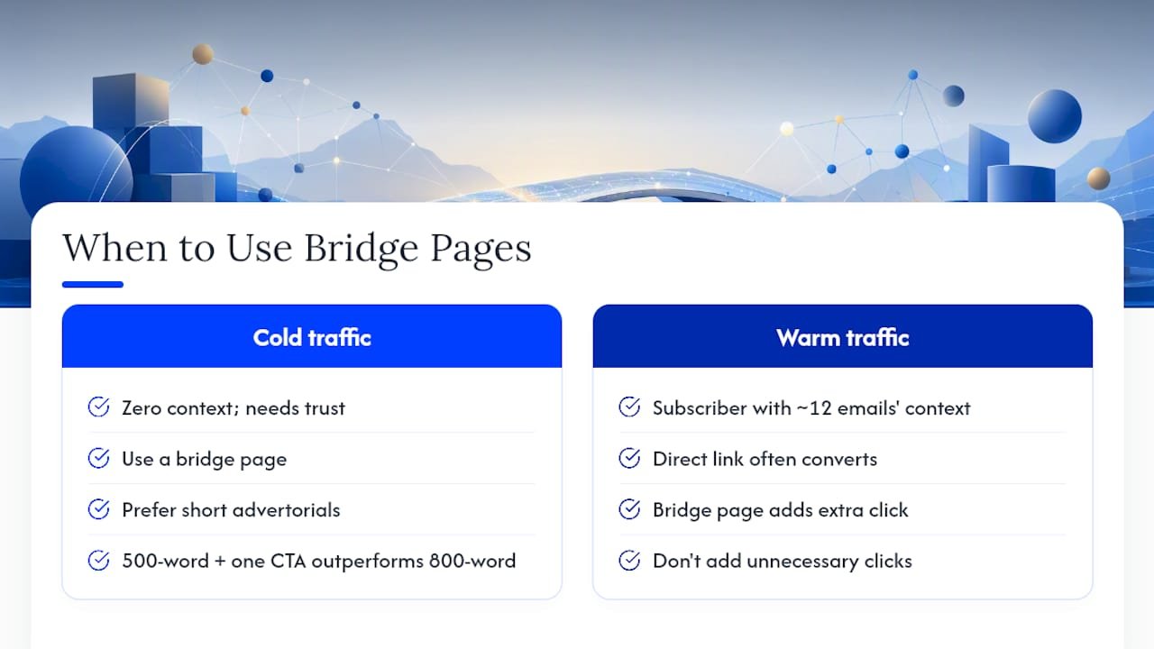
One pattern I’ve seen repeatedly with people I coach: the biggest lift usually doesn’t come from a fancier design, it comes from cutting the page down. A five-hundred-word advertorial with one clear CTA consistently outperforms the eight-hundred-word version stuffed with extra testimonials and a second CTA block. Less really does convert more, once trust is already doing the heavy lifting.
AI tools have made building the repetitive parts of these pages (spec tables, fit-check blocks, FAQ drafts) fast enough to produce five variants in the time it used to take to write one. That only works if a human still checks the offer details and the tone before it goes live.
— Will
How Willbuckley Turns These Templates Into Launch-Ready Pages
Reading about bridge page structure is one thing. Building six variants, testing them, and knowing which microcopy actually moves your click-through rate is another. Willbuckley gives you both: a coaching approach built specifically around AI-assisted workflows, so you’re not starting from a blank page every time you need a new advertorial, quiz, or review layout.

The template packs and coaching content cover the exact structure walked through above, plus variants for different traffic sources and offer types, so you can adapt one skeleton to five different products instead of rebuilding from scratch each time. The goal is fewer hours per page and a higher starting click-through rate, because you’re working from a structure that’s already been stress-tested rather than guessing at what belongs above the fold.
If you want to see the format in action before you build your own, check out the sample bridge page and use it as a working reference for your next campaign.
Sources
- What is a Bridge Page in Affiliate Marketing? Definition, Types & Examples
- Bridge page — Rank Math SEO glossary
- Affiliate Bridge Page Template That Pre-Sells Without Sounding Pushy – Goho Money
- How to Build Bridge Pages for Affiliate Marketing (with Examples) – KeywordRush